Re: Disney Infinity Fans Logo?
![]() by ryanator008 » Wed Jan 30, 2013 8:37 pm
by ryanator008 » Wed Jan 30, 2013 8:37 pm
Yeah, this is turning out amazing!
I hope that this was a very informative and well researched post. If it wasn't don't worry, that's the majority of the time. 

ryanator008- Posts: 67
- Joined: Thu Jan 24, 2013 1:34 am
- Main Console: Xbox One
- XBL ID:
- NN ID:
- Disney ID:
- Steam:
Re: Disney Infinity Fans Logo?
![]() by Sheriff Woody » Wed Jan 30, 2013 8:51 pm
by Sheriff Woody » Wed Jan 30, 2013 8:51 pm
yay, i get to be the client. ok then, here's a more specific brief ...
full named logo layout to be 72dpi and 550px wide by 110px high. based on the image below please make "ANS.COM" the same style and size as the "INF_ITY" in the previous word. please match the red around the "F" with the red around the "IN"

final image to be provided as a .png file with a clear background to allow it to be used to overlay similar to the example below ...
many thanks in advance for the time you are spending on this
full named logo layout to be 72dpi and 550px wide by 110px high. based on the image below please make "ANS.COM" the same style and size as the "INF_ITY" in the previous word. please match the red around the "F" with the red around the "IN"
final image to be provided as a .png file with a clear background to allow it to be used to overlay similar to the example below ...
many thanks in advance for the time you are spending on this


Sheriff Woody- Posts: 3768
- Joined: Fri Jan 18, 2013 5:25 pm
- Location: 20 miles west of London. England
- Main Console: PS4
- PSN ID:
- Disney ID:
Re: Disney Infinity Fans Logo?
![]() by Adscan » Thu Jan 31, 2013 2:39 am
by Adscan » Thu Jan 31, 2013 2:39 am
Ok, Since your my client I hope your looking forward to an invoice. 
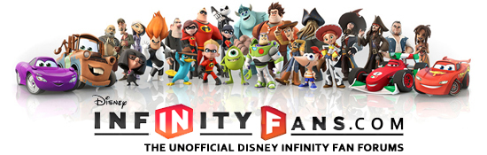
Please understand I care about your product and I personally want to see it succeed out there and as your Multiple Award Winning Creative Director I will have to advise you against the division of the icon component of the logo. This is normally done with interesting font caps and such but to do it with the icon design will create more problems with your branding across most mediums and detract from your brands immediate identification. Remember that while we want to create a unique brand for Disney Infinity Fans that you love, at the end of the day it's the end user that you want to love it, Am I right? Also it weakens the fun aspect of creating a parody on the original logo.
So we have taken your latest input and come up with this.

I believe this is much closer to what your looking for since your latest feedback minus the Icon division.
With the mock art you supplied I am assuming you have photoshop and I will be happy to supply the artwork in a layered psd file for you to use as you see fit. Simply saving a logo as a transparent gif or png will remove the anti aliasing. This will leave you with a solid jagged edge and at that scale for web use would be horrible.
I have taken the liberty to assemble a banner for you based of your sample.
If your happy to go ahead I will PM you links for masters but remember I am happy to make anything we need as a active member of this awesome community.
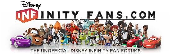
Please understand I care about your product and I personally want to see it succeed out there and as your Multiple Award Winning Creative Director I will have to advise you against the division of the icon component of the logo. This is normally done with interesting font caps and such but to do it with the icon design will create more problems with your branding across most mediums and detract from your brands immediate identification. Remember that while we want to create a unique brand for Disney Infinity Fans that you love, at the end of the day it's the end user that you want to love it, Am I right? Also it weakens the fun aspect of creating a parody on the original logo.
So we have taken your latest input and come up with this.
I believe this is much closer to what your looking for since your latest feedback minus the Icon division.
With the mock art you supplied I am assuming you have photoshop and I will be happy to supply the artwork in a layered psd file for you to use as you see fit. Simply saving a logo as a transparent gif or png will remove the anti aliasing. This will leave you with a solid jagged edge and at that scale for web use would be horrible.
I have taken the liberty to assemble a banner for you based of your sample.
If your happy to go ahead I will PM you links for masters but remember I am happy to make anything we need as a active member of this awesome community.

Adscan- Posts: 487
- Joined: Sat Jan 26, 2013 1:10 am
- Location: Blue Mountains, Australia
- Main Console: PS4
- XBL ID:
Re: Disney Infinity Fans Logo?
![]() by toops » Thu Jan 31, 2013 3:43 am
by toops » Thu Jan 31, 2013 3:43 am
as someone who has done logo work in the past for clients, i am thoroughly enjoying this thread haha and i do agree with adscan on this last post in maintaining the icon and the use of the characters to break the line makes an already fantastic for a banner picture look naturally with the website name. my only criticism would be the difference in kerning from the icon and the tagline to the rest of the type in the website, i think the "inity fans" should be tightened up a little bit especially between infinity and fans, that gap is definitely drawing my eye. i understand that you're trying to mimic the original infinity logo but because the icon part is smack in the middle it can be more easily balanced in the space. but again this is awesome, and i vote for it to definitely be the banner 
as far as a logo though i really like the balance of this one, and since the banner has the tagline and the url you wouldn't need them necessarily here, and it would read really nice even at that much smaller scale, you could even move fans to the left a little and add a .com to it as well if the url was still needed (i.e. as a forum signature or an avatar elsewhere, facebook etc)

awesome work man, sorry if this is too nitpicky
as far as a logo though i really like the balance of this one, and since the banner has the tagline and the url you wouldn't need them necessarily here, and it would read really nice even at that much smaller scale, you could even move fans to the left a little and add a .com to it as well if the url was still needed (i.e. as a forum signature or an avatar elsewhere, facebook etc)
awesome work man, sorry if this is too nitpicky


toops- Posts: 1286
- Joined: Thu Jan 24, 2013 7:01 am
- Main Console: PS3
Re: Disney Infinity Fans Logo?
![]() by Nibelilt » Thu Jan 31, 2013 5:49 am
by Nibelilt » Thu Jan 31, 2013 5:49 am
D. All of the above
(Clarification: I agree with everyone saying this is some awesome work!)
(Clarification: I agree with everyone saying this is some awesome work!)
- STEEL YOUR BUTT -
Left DIF: bluntly, non-Infinity topics feel soulless
Left DIF: bluntly, non-Infinity topics feel soulless


Nibelilt- Posts: 1293
- Joined: Thu Jan 24, 2013 7:09 pm
- Location: Game Central Station, Litwak's Arcade
- Main Console: Wii U
- PSN ID:
- NN ID:
Re: Disney Infinity Fans Logo?
![]() by mikefan » Thu Jan 31, 2013 9:48 pm
by mikefan » Thu Jan 31, 2013 9:48 pm
I absolutely love these banners and such!
Mike is my favorite Disney Character!
He's funny and I love Green!
He's funny and I love Green!

mikefan- Posts: 185
- Joined: Wed Jan 30, 2013 8:59 pm
- Main Console: PS4
Re: Disney Infinity Fans Logo?
![]() by mdewater » Thu Jan 31, 2013 10:39 pm
by mdewater » Thu Jan 31, 2013 10:39 pm
Definitely agree about not splitting up the IN and F. It looks MUCH better together. Awesome banner!
mdewater- Posts: 233
- Joined: Thu Jan 24, 2013 3:27 am
Re: Disney Infinity Fans Logo?
![]() by Adscan » Thu Jan 31, 2013 11:02 pm
by Adscan » Thu Jan 31, 2013 11:02 pm
Thanks for the kind feedback everyone and how great does the the new banner look! =]
Adscan- Posts: 487
- Joined: Sat Jan 26, 2013 1:10 am
- Location: Blue Mountains, Australia
- Main Console: PS4
- XBL ID:

Adscan- Posts: 487
- Joined: Sat Jan 26, 2013 1:10 am
- Location: Blue Mountains, Australia
- Main Console: PS4
- XBL ID:
22 posts
• Page 2 of 3 • 1, 2, 3
Return to Disney Infinity fan art
Who is online
Users browsing this forum: No registered users and 8 guests