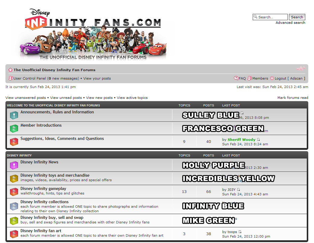
The green definitely stands out and I would have to say that a green colour should be used for any important announcements this forum has, if that is possible in the site's coding. I would count important as anything reagarding competitions, new features, changes and new partnerships.
May I see the green more like the Francesco's wing green and see if that looks any better than the Mike green?
Also I would personally like to see the blue more like Sulley's blue from the site picture at the top. It would look less grey and may stand out more on the page.
Feel free to disagree with me people. This forum is as much yours as it is mine and input from more people will get the foums looking how you want them to.
Re: New Colour Scheme
![]() by Mr Penguin Knight » Mon Feb 25, 2013 3:19 pm
by Mr Penguin Knight » Mon Feb 25, 2013 3:19 pm


Mr Penguin Knight- Posts: 738
- Joined: Sat Jan 26, 2013 10:12 pm
- Location: UK
- Main Console: Wii U
Re: New Colour Scheme
![]() by Nibelilt » Mon Feb 25, 2013 3:42 pm
by Nibelilt » Mon Feb 25, 2013 3:42 pm
I like the green, but Franceso's green like MPK suggested would be a bit better in my opinion.
I don't mind the blue, but I think it looks a bit too much like the grey that we have now.
My vote goes to red for read, green for new posts, and blue for sticky posts.
I don't mind the blue, but I think it looks a bit too much like the grey that we have now.
My vote goes to red for read, green for new posts, and blue for sticky posts.
- STEEL YOUR BUTT -
Left DIF: bluntly, non-Infinity topics feel soulless
Left DIF: bluntly, non-Infinity topics feel soulless


Nibelilt- Posts: 1293
- Joined: Thu Jan 24, 2013 7:09 pm
- Location: Game Central Station, Litwak's Arcade
- Main Console: Wii U
- PSN ID:
- NN ID:
Re: New Colour Scheme
![]() by Adscan » Mon Feb 25, 2013 10:01 pm
by Adscan » Mon Feb 25, 2013 10:01 pm
Alrighty, Here are the choices.
No more remakes, please.
Pick from these and then I will make the finals.
No more remakes, please.
Pick from these and then I will make the finals.


Adscan- Posts: 487
- Joined: Sat Jan 26, 2013 1:10 am
- Location: Blue Mountains, Australia
- Main Console: PS4
- XBL ID:
Re: New Colour Scheme
![]() by toops » Mon Feb 25, 2013 10:03 pm
by toops » Mon Feb 25, 2013 10:03 pm
i like sully or infinity blue for stickies, and francesco green for unread. that's my vote! thanks for the effort adscan 


toops- Posts: 1286
- Joined: Thu Jan 24, 2013 7:01 am
- Main Console: PS3
Re: New Colour Scheme
![]() by Sheriff Woody » Mon Feb 25, 2013 10:09 pm
by Sheriff Woody » Mon Feb 25, 2013 10:09 pm
so many colours !!!
i thought i had accidentally clicked on the My Little Pony Friendship is Magic topic
i thought i had accidentally clicked on the My Little Pony Friendship is Magic topic


Sheriff Woody- Posts: 3768
- Joined: Fri Jan 18, 2013 5:25 pm
- Location: 20 miles west of London. England
- Main Console: PS4
- PSN ID:
- Disney ID:
Re: New Colour Scheme
![]() by Mr Penguin Knight » Mon Feb 25, 2013 11:29 pm
by Mr Penguin Knight » Mon Feb 25, 2013 11:29 pm
I to agree with Francesco green for unread and blue for anything important.
[Oh I do like to be a nuisance]
[Oh I do like to be a nuisance
Mr Penguin Knight- Posts: 738
- Joined: Sat Jan 26, 2013 10:12 pm
- Location: UK
- Main Console: Wii U
Re: New Colour Scheme
![]() by Adscan » Tue Feb 26, 2013 10:59 am
by Adscan » Tue Feb 26, 2013 10:59 am
So Francesco Green for Unread...
Really?... No takers on the the purple?
I will wait another day before making the icons for more votes and, of course, Woodys thoughts.
Really?... No takers on the the purple?
I will wait another day before making the icons for more votes and, of course, Woodys thoughts.
Adscan- Posts: 487
- Joined: Sat Jan 26, 2013 1:10 am
- Location: Blue Mountains, Australia
- Main Console: PS4
- XBL ID:
Adscan- Posts: 487
- Joined: Sat Jan 26, 2013 1:10 am
- Location: Blue Mountains, Australia
- Main Console: PS4
- XBL ID:
Re: New Colour Scheme
![]() by Nibelilt » Tue Feb 26, 2013 2:04 pm
by Nibelilt » Tue Feb 26, 2013 2:04 pm
My votes are the same. Sulley for stickies and Francesco for unread. Good job! 
Though I do love that Incredibles icon
Though I do love that Incredibles icon
- STEEL YOUR BUTT -
Left DIF: bluntly, non-Infinity topics feel soulless
Left DIF: bluntly, non-Infinity topics feel soulless
Nibelilt- Posts: 1293
- Joined: Thu Jan 24, 2013 7:09 pm
- Location: Game Central Station, Litwak's Arcade
- Main Console: Wii U
- PSN ID:
- NN ID:
22 posts
• Page 2 of 3 • 1, 2, 3
Return to Forum Related Suggestions, Ideas, Comments and Questions
Who is online
Users browsing this forum: No registered users and 14 guests