Just thought I'd create this topic to see what other peoples opinions on the new colour scheme is.
While I appreciate that it is new, and so I may not have adjusted to it yet, I don't feel that delighting topics, instead of highlighting, that have new posts in the them is the way to go. I can see that red is the main colour of Disney Infinity so I can see why the forums have chosen this as the topics main colour.
My idea is to have any topics that have a new post in have a green logo instead of the grey that it has now. I would also suggest having a third colour, blue, for any very important topics. These colours are the colous on the infinity base and so won't feel out of place from the Disney Infinity aesthetics.
Just my thoughts and I was wondering what others thought.


Mr Penguin Knight- Posts: 738
- Joined: Sat Jan 26, 2013 10:12 pm
- Location: UK
- Main Console: Wii U
Re: New Colour Scheme
i was about to post the same thing, but i was going to suggest to just switch them, so that the bright red meant new posts and the "greyed out" red be no new posts. the way it is now definitely seems backwards.
but i do like the new icons and red and black always look nice
but i do like the new icons and red and black always look nice


toops- Posts: 1286
- Joined: Thu Jan 24, 2013 7:01 am
- Main Console: PS3
Re: New Colour Scheme
i'll put the idea of colour versions to our resident etch when he wakes up (he lives in the land down under) 


Sheriff Woody- Posts: 3768
- Joined: Fri Jan 18, 2013 5:25 pm
- Location: 20 miles west of London. England
- Main Console: PS4
- PSN ID:
- Disney ID:
Re: New Colour Scheme
- STEEL YOUR BUTT -
Left DIF: bluntly, non-Infinity topics feel soulless
Left DIF: bluntly, non-Infinity topics feel soulless


Nibelilt- Posts: 1293
- Joined: Thu Jan 24, 2013 7:09 pm
- Location: Game Central Station, Litwak's Arcade
- Main Console: Wii U
- PSN ID:
- NN ID:


Mr Penguin Knight- Posts: 738
- Joined: Sat Jan 26, 2013 10:12 pm
- Location: UK
- Main Console: Wii U
Re: New Colour Scheme
the intention will be red (has been read) and green (has been unseen)


Sheriff Woody- Posts: 3768
- Joined: Fri Jan 18, 2013 5:25 pm
- Location: 20 miles west of London. England
- Main Console: PS4
- PSN ID:
- Disney ID:
Re: New Colour Scheme
I actually like the grey for unread and would like to see the gradient borders to have the same red - orange blend as the icon.
With the forum looking a tad drab since all the grey I think this will pick up the whole page nicely as opposed to having a very plain and corporate page and crazy icons.
Something like:
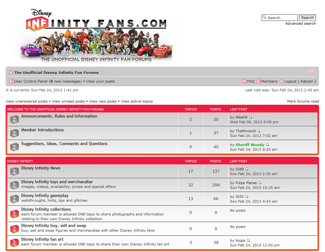
I think this is overall nicer, It keeps the page fun and also continues to tie into the Disney Infinity colour spec instead if introducing a new colour all together.
As always I am happy to make whatever the overall community and Woody would like so if it ends up being green instead of grey for unread then I will bash them out.
With the forum looking a tad drab since all the grey I think this will pick up the whole page nicely as opposed to having a very plain and corporate page and crazy icons.
Something like:

I think this is overall nicer, It keeps the page fun and also continues to tie into the Disney Infinity colour spec instead if introducing a new colour all together.
As always I am happy to make whatever the overall community and Woody would like so if it ends up being green instead of grey for unread then I will bash them out.


Adscan- Posts: 487
- Joined: Sat Jan 26, 2013 1:10 am
- Location: Blue Mountains, Australia
- Main Console: PS4
- XBL ID:
Re: New Colour Scheme
Ok, maybe the contrasting between all the grey and the bright red is a bit much.
We could desaturate the red, by then what is the point as it won't match anything.
So I will make some time today (if I can) and make up the green icons.
We could desaturate the red, by then what is the point as it won't match anything.
So I will make some time today (if I can) and make up the green icons.


Adscan- Posts: 487
- Joined: Sat Jan 26, 2013 1:10 am
- Location: Blue Mountains, Australia
- Main Console: PS4
- XBL ID:
Re: New Colour Scheme
Before I remake all the greys I just wanted to make sure I got the green you guys are looking for.
So here is a sample;
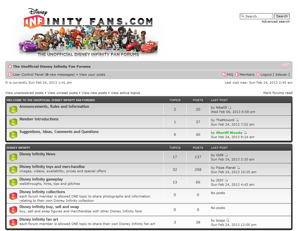
I sampled the green from the Mike Wazowski figure.
There is no missing that green.
Also I would not dare disregard the wisdom of MPK and so I did a version with the blue that I sampled of an image of the actual Infinity base.
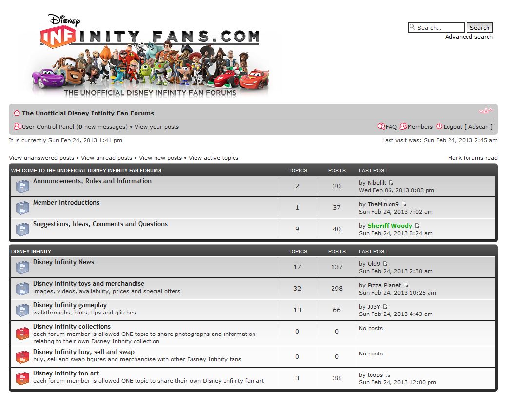
I think I am leaning toward the blue. It feels like it fits better overall, let me know what you guys think and I will get all the greys replaced.
So here is a sample;
I sampled the green from the Mike Wazowski figure.
There is no missing that green.
Also I would not dare disregard the wisdom of MPK and so I did a version with the blue that I sampled of an image of the actual Infinity base.
I think I am leaning toward the blue. It feels like it fits better overall, let me know what you guys think and I will get all the greys replaced.


Adscan- Posts: 487
- Joined: Sat Jan 26, 2013 1:10 am
- Location: Blue Mountains, Australia
- Main Console: PS4
- XBL ID:
22 posts
• Page 1 of 3 • 1, 2, 3
Return to Forum Related Suggestions, Ideas, Comments and Questions
Who is online
Users browsing this forum: No registered users and 34 guests
